Windows 10 Mobile review – the future’s bright but be wary

Continuum is fantastic, and the overall interface is now much cleaner to use, but performance is a problem for now
Cortana
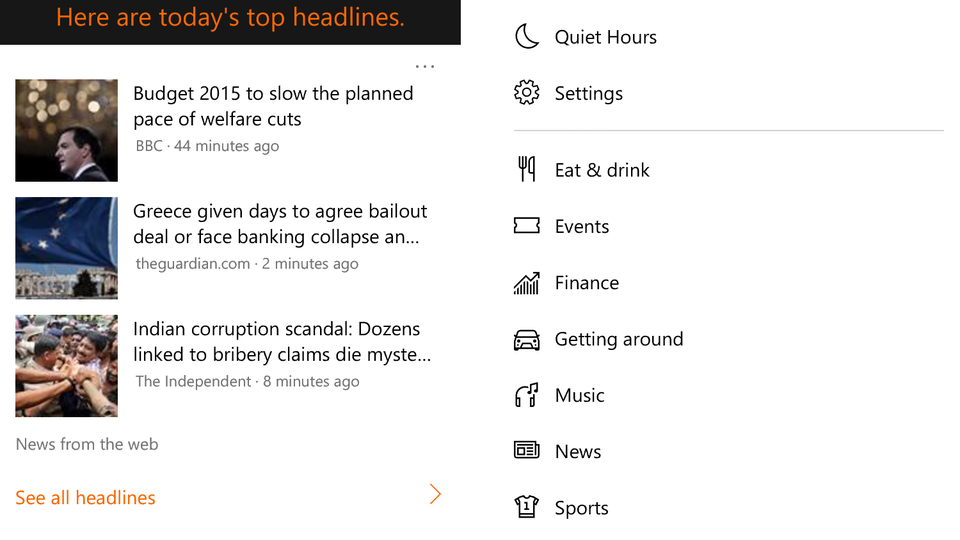
In terms of appearance, Cortana has changed very little since Windows Phone 8.1. You can still ask it questions which it will endeavour to answer by searching the web, and it will still collate news stories and articles from around the web relating to your personal interests in one handy hub.
In terms of functionality, however, Microsoft’s digital assistant really comes into its own with Windows 10, thanks in part to its appearance on Windows 10 desktops. Now that Cortana is built straight into your PC, laptop and tablet, your phone will now receive any reminders you set on another device and alert you about them when you’re out and about. For instance, it can remind you to pick up certain groceries next time you’re at the supermarket, take the bins out at 8pm, or feed the cat when you get home. This is one of my favourite things about Cortana, and it makes your phone feel that much smarter, particularly when it all syncs up with your PC.

^ If you tell Cortana what your interests are, she can pull together news stories from across the web relating to your favourite hobbies
Cortana can send dictated emails in Windows 10 as well. Using its voice recognition software, it can recognise who you want to send the email to, the subject line and the message itself and compile it all correctly into a single email, allowing you to send emails much faster than having to type them out.
Live Tiles, Personalisation, Action Centre
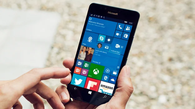
Windows 10 has a much cleaner interface than Windows Phone 8.1. The Start screen is still divided into Live Tiles, but the gaps between them have now shrunk, giving it a more streamlined appearance. You can also add full-screen background images and change the transparency of the Live Tiles, and all phones now support up to three columns of Live Tiles regardless of screen resolution.
Windows 10’s Action Centre has also been improved, as you now have the option to expand its initial list of four shortcut buttons into a full grid of sixteen, making it easier to access things like Flight Mode, the flashlight and Quiet Hours without having to dive into the main Settings menu. The icons also look the same as they do on the desktop version of Windows 10, too.

This through-line of design applies to apps as well, as each app now looks virtually identical to its desktop counterpart. This is down to Windows 10’s universal apps, which have been specifically designed with this kind of purpose in mind, allowing you to have the same kind of user experience regardless of which device you happen to be using.
Settings
Even the main Settings menu now has the same categories as your Windows 10 desktop, but sadly it’s not quite as well organised as you might have hoped. The search bar can help cut down the time you spend looking for certain options, but you have to be very specific to find the appropriate setting. Type in ‘Screen’, for instance, and the only available results will be ‘Glance Screen’ and ‘Lock Screen’ rather than any of the Display settings.
Some settings appear in rather unexpected locations, too. Some display options, for example, such as sunlight readability, Glance Screen, battery saver and the colour profile settings are all housed in the Extras category rather than the main Display section in System, which isn’t exactly useful if you’re trying to find something quickly. The same goes for Network Services, which controls call settings and SMS character settings related to your SIM card. This is also found in the Extra category instead of its more logical location in Network & Wireless, or even in the Phone option in System.
This is a bit of a shame, especially since the desktop version of Windows 10 doesn’t need an odds-and-ends Extras section, but it’s certainly much better than the big long list of settings we had in Windows Phone 8.1.


