Canonical Ubuntu 11.10 review
A minor update, maybe, but Ubuntu remains the easiest-to-use Linux distribution. However, we'd like to see a bit more flexibility in the user interface
With Ubuntu 11.04 Canonical completely overhauled its Linux operating system, improving performance and adding the new Unity interface. Now, with Ubuntu 11.10 (codenamed Oneiric Ocelot), it’s refining the experience.
For the most part, Ubuntu 11.10 consists of a series of minor tweaks, designed to address the issues with 11.04. For starters, Ubuntu 11.04 had an odd selection of search menus. So, you could search for programs and files through the main Dash search menu, but there were also dedicated Documents and Applications search menus.

The new Dash is the only search menu in Ubuntu 11.10
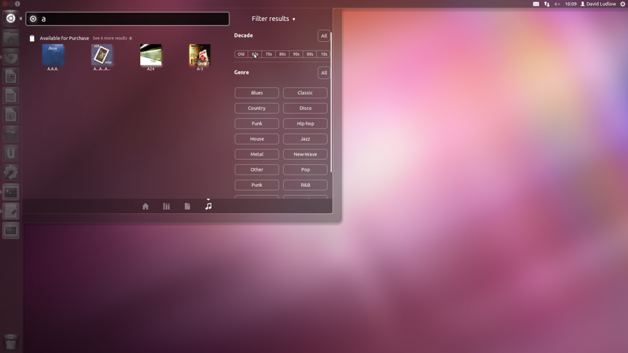
With Ubuntu 11.10 everything has been simplified, and there’s now a single Dash. When you open this menu, you can select the corresponding icon to search everything, applications, documents or music individually. It makes a lot more sense this way.
New Lenses (the new name for Places), let you filter your search results by content. So, for music, you can select the genre and age, while for documents you can select the type, size and age. It’s a little tweak, but one that generally makes the OS that bit easier to use.

Lenses let you filter search results intelligently by type.
We were hoping that Canonical would update the Launcher dock, so that you can choose where to place it. Sadly, that isn’t the case and it’s resolutely stuck to the left-hand side of the screen. Quite why there’s no option to move it is beyond us, but it’s a touch annoying that this simple control doesn’t exist.
Details | |
|---|---|
| Price | £0 |
| Details | www.ubuntu.com |
| Rating | ***** |


