Canonical Ubuntu 10.10 Netbook Edition review
It certainly makes the most of a netbook screen, but not all parts of the interface are easier to use and there could be some hardware issues.
Netbooks generally have two main problems: they’re under-powered and their low-resolution screens can be hard to work on. With Ubuntu 10.10 Netbook Edition, Canonical is hoping to change that by building a light-weight OS with an interface designed for the low-resolution screens. If you’re interested in Linux for your PC, read our Ubuntu 10.10 Desktop Edition review.
In many ways, it’s been very successful, with the simple installation process working quickly and efficiently on our test netbook. However, as we write this review, we couldn’t use the normal method for creating a bootable USB drive and had to install using a USB CD-ROM.
It’s also worth pointing out that if your netbook has short-cut keys to turn on features, such as the wireless LAN, these probably won’t work in Ubuntu. So, make sure that all of the features you want are turned on before you install the OS.
As with the Desktop edition, there’s the choice to partition your netbook’s hard disk so that you can still boot into Windows. You can even read your Windows partition from inside Ubuntu, so that you can read all of your old files.
Once you’re into Ubuntu you realise that the user interface, called Unity, is completely different to anything you’ve seen before and a big change from the previous Netbook Remix. Most netbooks have fairly low vertical resolutions (600 pixels typically), but width isn’t so bad (1,024 pixels). So, Canonical has come up with a user interface that maximises height.

So, there’s no taskbar at the bottom, just the single strip of notifications at the top of the screen. Down the left-hand side is the Launcher, which holds icons for all of your commonly used applications. When you start an application, white arrows appear to show that it’s running. In this way, the Launcher also becomes your task switcher.
Clicking the Applications button takes you into all of the other programs that are available. Running one of these pops its icon up in the Launcher, where you can right-click it and pin it in place for easy access later on. Icons can also be rearranged through dragging and dropping.
When an application runs its menu bar pops up into the bar at the top of the screen, so that vertical resolution is maximised. It works really well and made our netbook screen feel a lot less cramped. If you want, you can switch an application back into a window and move it around the screen or reveal the desktop.
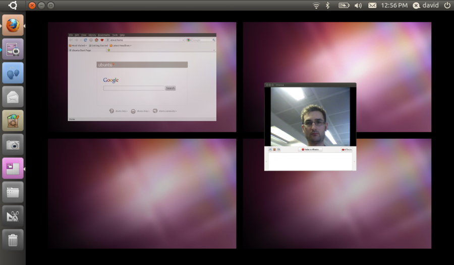
However, we found that it’s better to use Workspaces instead. Click the button in the Launcher and you’re shown, Mac OS X Expose-style, four virtual desktops plus all of your open applications. You can either click an application to switch to it, select a virtual desktop to move to that or drag an application from one workspace to another. It’s a brilliant system and means that your netbook’s cramped display never gets too overloaded.

Details | |
|---|---|
| Price | £0 |
| Details | www.ubuntu.com |
| Rating | **** |


