Doro 8035 review: User-friendly software, weak hardware
The Doro 8035 does a good job of hiding the scary parts of Android, but weak hardware still struggles
Pros
- Doro software is welcoming to newcomers
- Decent screen
- Removable battery
Cons
- Atrocious battery life
- Poor performance
- Dreadful camera
Swedish company Doro has carved itself out a cosy little niche in the smartphone world. While the Apples, Samsungs and Huaweis of this world chase speed and features, Doro is trying to keep things simple.
There’s a specific reason for this: its products are aimed at seniors who may not be familiar with technology, and especially the labyrinthine settings of Android. Doro’s handsets try to keep things as simple as possible, and the Doro 8035 continues in this tradition, with a heavily skinned version of Android for under £150.
Does it succeed? Not by most of the metrics that we usually rate phones, but it may still be worth your time.
Doro 8035 review: What you need to know
The Doro 8035 won’t win any awards for speed. Bluntly, it wouldn’t be guaranteed a podium finish if it somehow time-travelled back to 2013, with its Qualcomm Snapdragon 210 processor and 2GB of RAM feeling sluggish doing pretty much anything.
Instead, Doro’s main interest is usability for seniors. The screen is a large 5in affair, Android is skinned to have big buttons with common-sense, readable labels and there’s a panic button on the back that can easily send emergency contacts a message with your GPS location, should you hit trouble.
Doro 8035 review: Price and competition
The Doro 8035 costs £140, and is a direct follow up to the Doro 8030. Trying to track down actual specs is a challenge for all of Doro’s products, but it doesn’t look too different on paper, with a slightly higher clock speed on the same processor: 1.1GHz bumped up to 1.3GHz.
While they don’t share the same user-friendly approach, you can get a lot more on paper for that kind of money. Our picks in that price range would be the Motorola Moto G7 Play (£150) and the larger Moto E5 Plus (also £150), but if money is tight then the Vodafone Smart X9 is a bargain at £99.
Given speed isn’t of the essence here, if you want userfriendly on a budget, it may even be worth sourcing an older iPhone. The iPhone 6, for example, can be picked up for around the £100 mark nowadays.
Doro 8035 review: Design
While nobody – bar maybe time travellers from the 1980s – would call the Doro 8035 sleek, it is pretty well designed for users who may be both frail and unfamiliar with smartphone tropes that many of us take for granted.
The 5in display is surrounded by thick borders on the top and the bottom, and there are three tactile buttons along the bottom reflecting the usual Android fare of home, back and menu buttons. These actually look touch sensitive, and it took me a little while to return to a world of physical buttons.
At 9.48mm thick, the Doro 8035 feels chunky in the hand, while being suitably well defended against knocks and scrapes. The entire back panel comes off for the battery to fly out, absorbing the shock if dropped, while the back and sides are made entirely from plastic. The screen is still vulnerable, of course, but it’s certainly more durable than most 2019 handsets.
There’s also room for a headphone jack and microSD card, supporting up to 32GB of space, which is often MIA on more expensive rivals. But perhaps the most interesting thing about the design is the large, round button which sits parallel with the camera lens. This is a panic button that can be linked to send an emergency text message with coordinates to family and friends in case of a fall, and can be set to a three-second long press, or three consecutive presses before springing into action.
One final oddity to note is button placement. The charging port sits on the right-hand side, where you’d typically expect the power button to be. The power button, meanwhile, is on the top of the phone, next to the headphone jack. This seems to be so that it plays nicely with the charging dock: an optional £20 accessory, which makes it easier to plug in and charge.
Doro 8035 review: Screen
The Doro 8035’s 5in display packs a resolution of 1,280 x 720, which is plenty for a phone in this budget. Generally, it’s a perfectly decent screen too, with the large, friendly icons and text appearing clearly, if in slightly muted tones.
It’s an IPS panel (you’re not getting OLED for this price), and it’s solid if unremarkable when tested by our colorimeter. The screen covers 84.8% of the sRGB gamut, with a contrast of 1,004:1. Viewing angles aren’t great, though, and its peak brightness only reaches 336cd/m2 – fine indoors of course, but less good in bright sunshine. Overall, the screen is fine for a phone at this price. Certainly not the best, but not the worst.
Doro 8035 review: Performance
Finding specs of the Doro 8035 is like taking part in the world’s most tedious treasure hunt, but through a combination of deep Google research and phone applications, I’ve finally been able to uncover what makes it tick. You’re looking at a 1.3GHz quad-core Snapdragon 210 processor, backed by 2GB of RAM and 16GB of internal storage, which can be expanded by up to a further 32GB of microSD storage too.
If that sounds a touch underwhelming, you probably have expectations set too high. The Doro 8035 is slow in pretty much everything it does. When the onscreen keyboard takes a couple of seconds to pop up, you can pretty much forget any kind of multitasking.
That’s unsurprising in a budget phone, but it becomes really obvious when you compare it to handsets in the same price range. Remember: The Moto E5 Plus and Moto G7 Play are both £10 more, while the Vodafone Smart X9 is £40 less:

It really is no contest at all, and damningly it’s only a marginal improvement on the Doro 8030. Just for completeness’ sake, here’s how the Doro 8035 compares when it comes to 3D graphical performance:

That’s all very disappointing, but the most worrying thing for the demographic involved is the dreadful battery life. The Doro 8035 is powered by a removable 2,500mAh battery, but in our looped video test, it lasted three hours’ less than its predecessor, clocking in at a dismal 7hrs 14mins.
We couldn’t quite believe how bad this was, so we tried again, and this time we were able to add an extra 17 minutes, taking it to 7hrs 31mins. This is truly appalling for a modern smartphone.

In mitigation, the Doro 8035 does let you manually change the battery, which is to be applauded. But when the battery is this bad out of the box, putting in a fresh one is unlikely to make too much of a difference, unless you carry a spare with you at all times.
Doro 8035 review: Software
Innovative hardware design tweaks like the panic button can only get you so far. By far the scariest part of a smartphone to the uninitiated is the operating system. What seems like common sense to Android old hands is weirdly labyrinthian to newbies, especially if they’re a touch technophobic.
Android 7 may be running under the surface, but the company does a good job of hiding it. Most of the time, anyway.
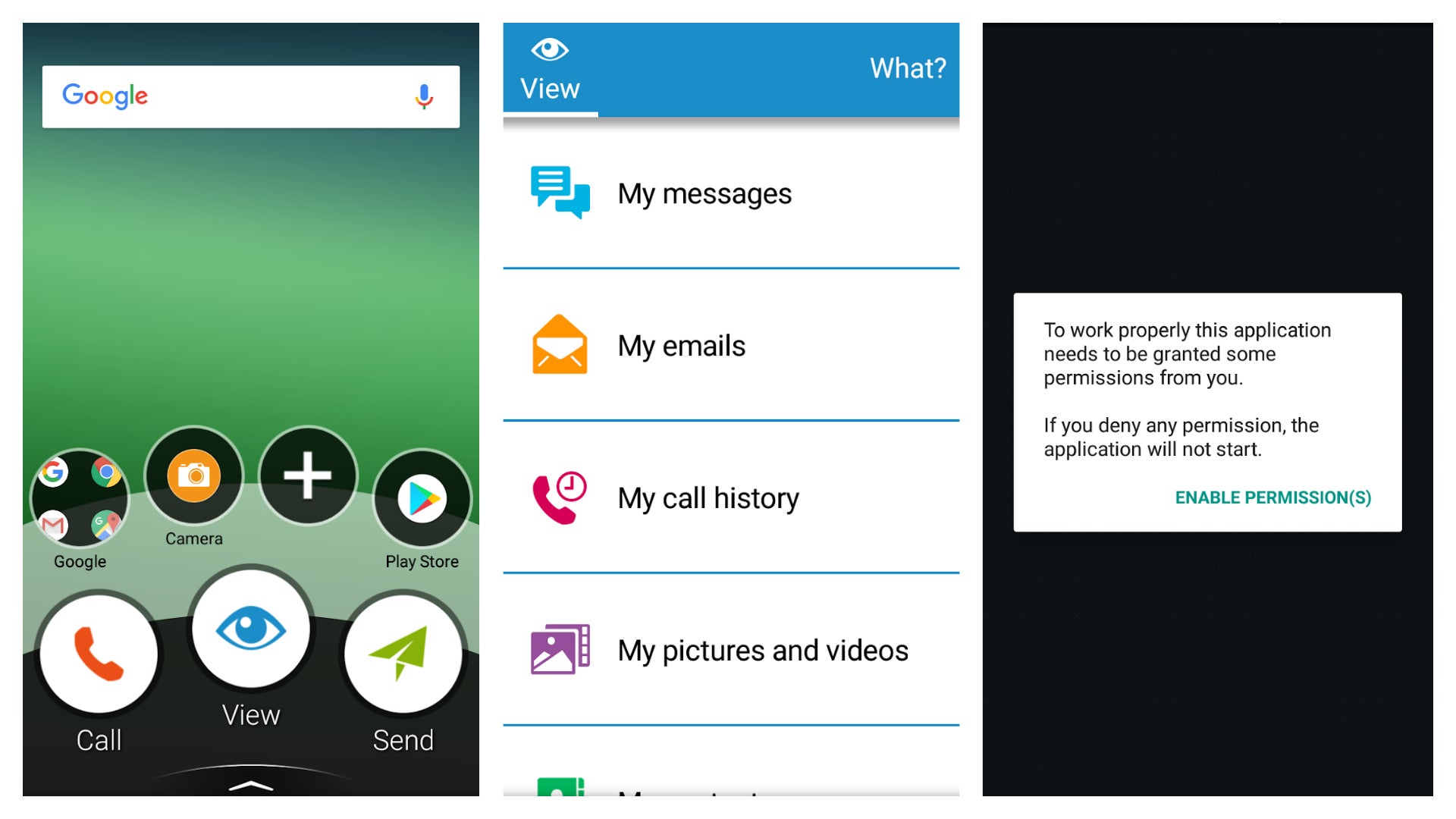
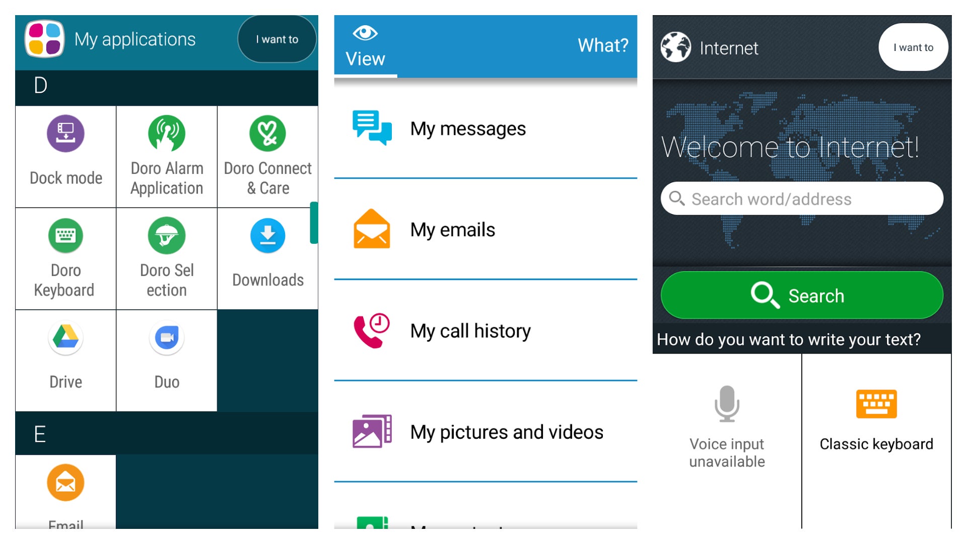
From the getgo, Doro tries to make it friendly with a series of choices. “Have you used a smartphone before?” it asks, and if you haven’t it suggests the beginner’s mode where the standard apps are replaced with actions. Three large buttons sit at the bottom of the screen: “Call,” “View”, and “Send.” Each one of these opens up a submenu. “View”, for example, opens a list including “my messages”, “my emails”, “my call history”, “my pictures and videos”, “my contacts”, “something on the internet”, “my calendar”, “the weather forecast” and more.
This generally works pretty well, I think. It’s hard to tell as someone who has reviewed dozens of smartphones over the years, but it seems logical enough.
Still, Android can’t help but poke out behind the scenes. The first time you access ‘calendar’ via the method above, for example, a popup appears, asking you to enable permissions, and you can often end up with familiar Android areas if you poke around. The notifications bar, for example, is completely unchanged.

Generally, it’s very helpful to novices, although there are a couple of phrases that seem to slip through the net. In settings, for example, you can set “the haptic feedback”, which isn’t a helpful term. Tapping through renames it to “vibrate on touch” which instantly explains the feature without the jargon. Little tech terms like this keep cropping up, and good as it is, perhaps a little more focus group testing would have helped smooth out these rough edges.
Doro 8035 review: Camera
To be fair, Doro doesn’t make a big deal of its cameras, other than to say they exist. A 5-megapixel camera sits on the back and a 2-megapixel can be found on the front. It meets this low expectation but it doesn’t go far beyond.
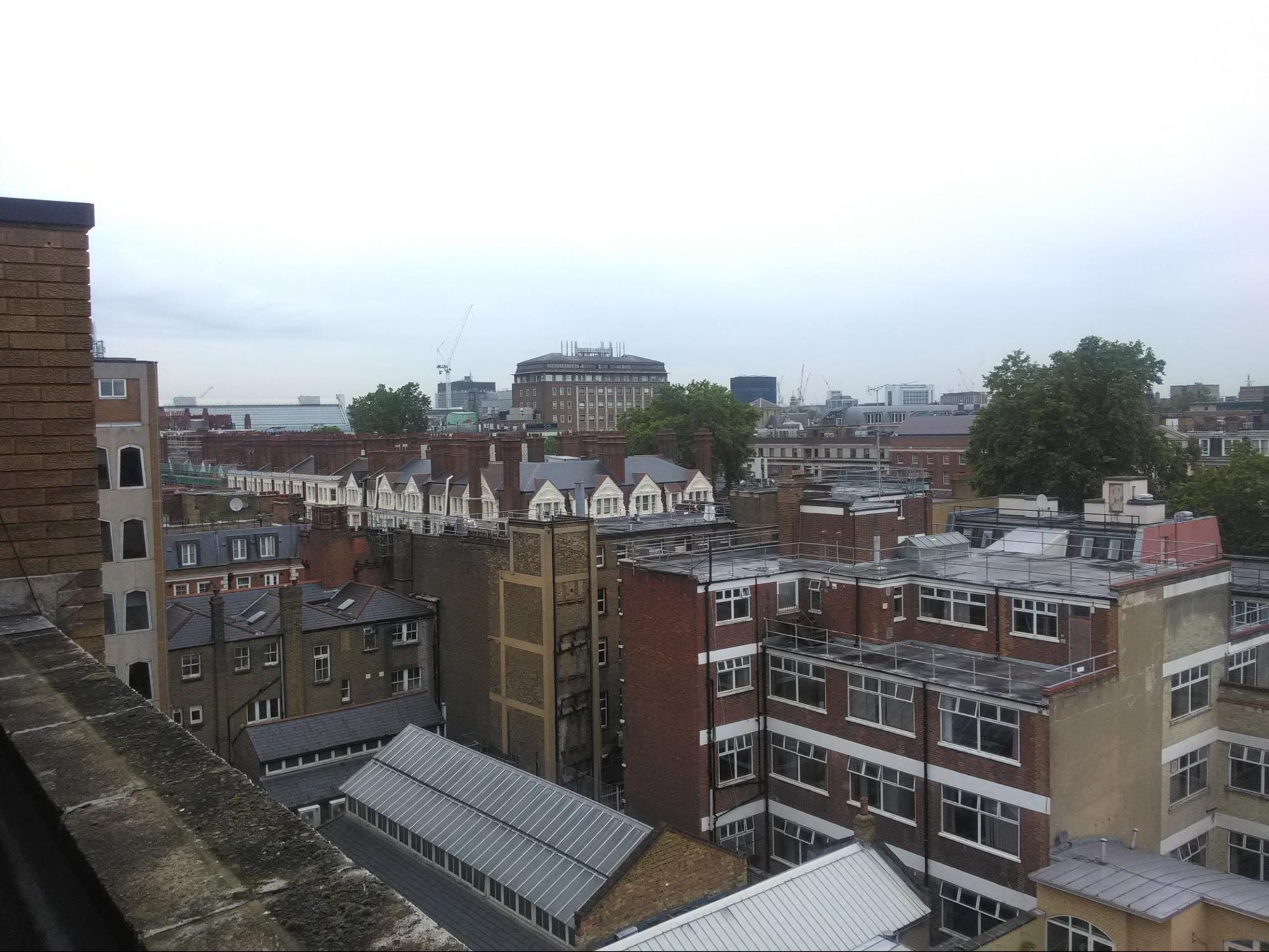
In good lighting conditions, the Doro takes a passable picture. But passable is as good as it gets: here is a zoomed shot compared to the Alcatel X1 – a £100 phone where we slated camera performance. As you can see, the Alcatel X1 picks up a lot more detail, and the colour accuracy is more neutral too, with the Doro 8035 presenting washed-out, dreary images.
Predictably, low-light conditions are even worse. Blurry, with a strange yellow tint, it doesn’t look good at all – the Alcatel looks positively brilliant in contrast. Even if you manage to look past the iffy colours, images are filled to the brim with visual noise, lacking finer details.
 There aren’t many settings to play with in order to help mitigate these issues, either. There’s just the same simplified menus as elsewhere (quality, for example, is either “high” or “low” – and for the avoidance of doubt, these were the former.) Selfies from the 2-megapixel front-facing camera are fine, if a little overprocessed.
Doro 8035 review: Verdict
By nearly every metric we’d normally rate a phone then, the Doro 8035 is a dud. It’s horribly slow, the camera is weak and its battery life is terrible – markedly worse than the previous generation, in fact.
But I have to concede that it does a very good job of pushing back against Android’s tech-heavy beating heart to provide an experience that’s impressively user-friendly. Yes, Android can’t help but poke through at the seams, but it’s still trying, and a lot of thought has gone into making the Doro 8035 seem undaunting to technophobes. In other words, you’re paying for the software, not the hardware.
So a lot depends on confidence with technology. If you, or the person you’re buying for, is a fast learner and prepared to get to grips with a phone, then there are far better options available, and for less money too. The Moto E5 Plus, for example, beats the Doro in every metric available. Even an old iPhone – maybe an iPhone 6 which should be under £100 by now – will offer better performance, with the added bonus of iOS’ comparatively simple layout.
But if you are buying for somebody that you know simply won’t use anything complicated, then the Doro 8035 stands alone, and is grudgingly worth a buy. I just wish they’d put as much thought into the hardware as they did the software.


