TAG Heuer Connected review – Android Wear gets classy

Finally a serious (smart)watch, the TAG Heuer Connected is much more than another Android Wear device
Specifications
Pedometer: Yes, Heart-rate monitor: No, Display size: 1.5in diameter LCD, Resolution: 360 pixels across (circular), OS support: Android 4.3+, Battery life: 1 day, Dimensions: 46×12.8mm, Weight: 52g
“It’s just standard Android Wear in a pretty case.” That’s what a colleague said to me when he heard I was reviewing the TAG Heuer Connected, and although he’s basically right, it’s a far too simplistic view.
You may as well say a Porsche 911 GT3 is no different from a VW Golf; they’re both German cars that get you from A to B, after all. But it’s the way the Porsche will get you from A to B – and how you’ll feel while driving it – that makes the difference, and ultimately justifies the price tag.
Although the TAG Heuer Connected runs Google’s Android Wear OS, and offers a familiar set of features to other Android Wear devices, it’s a very different proposition to anything else that has come before it. That’s because at its heart, the Connected is a proper watch first and a smartwatch second. It’s exactly what watch lovers have been waiting for.
TAG Heuer Connected review: Design and features
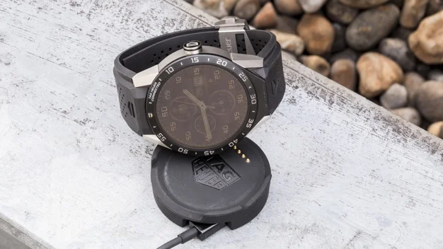
The TAG Heuer Connected is the best-looking smartwatch to date, but more impressive than that is that it’s also a great-looking watch. I placed the Connected in one of my watch boxes alongside a mix of TAG Heuer, Rolex and Cartier timepieces and it didn’t look out of place. Put an Apple Watch, Motorola Moto 360 2 or Samsung Gear S2 in the same company and they’d stick out like a sore thumb.
That’s in large part due to the classic TAG Heuer design of the watch, but also the materials used in the construction of the watch. Grade 2 titanium makes up the bulk of the case, which makes it very strong, resistant to corrosion and incredibly light. The rubber strap is secured with a standard TAG Heuer deployment clasp, which is also titanium – it’s designed to allow for easy adjustment, ensuring a comfortable fit.
And although the watch is very light – 82g according to my digital scales – it’s also very large, with a 46mm case diameter. To give you some perspective, the photograph below shows the TAG Heuer Connected flanked by a Rolex Submariner and a TAG Heuer Monza, both of which are dwarfed by it.

Bear in mind, though, that the design of these watches dates back decades, and in the case of the Monza, all the way back to 1933. With the trend moving towards larger watches these days, the Connected will fit in among its contemporaries.
If there’s one thing that lets the design down slightly, it’s the fact that the back is plain black plastic. I wasn’t expecting it to be sapphire crystal glass, since there’s no mechanical movement to see, but I’d rather it was titanium like the rest of the case.
Still, with the watch strapped on your wrist, it looks every bit the luxury timepiece, and to complete the effect it also comes with a selection of TAG Heuer Carrera faces to choose from. There’s the classic three-hand design, a triple sub-dial chronograph or a dual time-zone GMT face to choose from.
That’s not all, though. There’s also a customisable “Themed” face, with three sub-dials. As standard, these have been set as a countdown timer, stopwatch and alarm, but it’s also possible to assign other data to those dials. Via Google Fit, you can set them to display steps taken, calories burned or distance walked, and in theory it’s also possible to set weather updates. I couldn’t get that to work, but with other apps able to send their data to the sub-dials on the Themed face, and more in the works, it’s a nice extra to have. TAG has also made an effort to tidy up Android Wear’s notifications: whenever you have any waiting for you, they’re represented by a tiny numeral on the face, keeping things simple.
Tag Heuer Connected review: Display
The screen is a 1.5in transflective LCD affair, and although some may wonder why TAG has decided not to use OLED technology, you only have to spend a few minutes with it on a bright, sunny day to know it made the right decision. Thanks to that transflective design, the Connected is a breeze to read whether you’re inside or out.
By default the screen will automatically dim when the watch detects you’re not using it, but it’s still easily readable in its dimmed state, and a light tap on the screen will wake it up. In fact, just twisting your wrist upwards will wake the display.

The resolution of the screen is 360 x 360, which gives it a pixel density of 240ppi. It’s not the highest-resolution Android Wear screen around, but it’s still a very good one. It’s crisp and clear, and it’s no chore to read your emails and messages on it, or even catch up on the news via the BBC News app.
Just as importantly, gestures and single-finger swiping are smooth as silk, making it simple to navigate around Android Wear. The sapphire crystal glass probably helps with that smooth feel, while also offering a degree of robustness that matches the watch’s chunky look.


