Xara Web Designer 10 Premium review
A slick and easy to use WYSIWYG web editor, Xara Web Designer 10 Premium is capable of producing sophisticated sites for multiple platforms
Specifications
OS Support: Windows XP or later, 500MB RAM, 300MB disk space, Minimum CPU: Intel Celeron/AMD Sempron, Minimum GPU: Built-in graphics processor, Minimum RAM: 500MB RAM, Hard disk space: 300MB disk space
Xara’s Web Designer is a WYSIWYG web editor that lets people without HTML or web skills create professional-looking websites. We’ve long been impressed with its sophistication and ease of use, but when we reviewed version 9 last year we were critical of its lack of support for the highly variable screen sizes found on mobile devices. Fortunately, version 10 sees the introduction of Responsive Website Design, a feature aimed at addressing just this issue. Unfortunately it’s only available in the Premium version we’re reviewing here, not the standard version.
In use, this software is much like the previous edition, which is no bad thing. Xara Web Designer 10 Premium’s clean interface provides an editing experience similar to desktop publishing, and surprisingly, given the wide range of features available, the interface is uncluttered. By default, the site you’re creating is displayed in a large window to the left, with its pages navigated via thumbnails to the right. Where pages have layers, these can be displayed and hidden again by clicking the arrow next to the thumbnail. Layers are used for transitions, an example of a transition being the behaviour triggered when the user moves their mouse over an element. Minimised to the right are frames holding the various line, fill and picture options.

It’s easy to start with one of Web Designer’s templates and customise it with your own content
FONTS OF PLEASURE
There’s also a designs gallery, and you can use this to create a new site from a range of available templates, many of which make a surprisingly good starting point. The gallery contains many shapes, page elements and widgets that you can use to add features to your web page. The gallery is also where you’ll find an excellent and interactive tutorial.
Advanced features include support for Google Fonts, which is a collection of more than 600 free fonts that are hosted by Google rather than your own server, and the new Supersites feature, which lets you present a small website in a single scrolling page instead of separate pages.

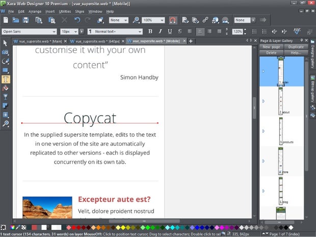
You can choose which content is linked between variants; edits to linked content are replicated between variants
While we found thumbnails in the designs gallery quicker to load than in version 9, they’re still a little on the small side, and it’s often necessary to open a template or drag an element to the page to get a full idea of what it looks like. The process is slowed down somewhat by the fact that some of the included content must be downloaded before it can first be used. It seems odd that the content installer, an optional utility that adds content including fill styles and dictionaries, doesn’t let you download all content in a one-time operation.
SUPERSITE ME
To get a better idea of how Web Designer handles varying screen widths, we started building a website using the Vue Supersite template. This contains three versions of the same scrolling site displayed on three different tabs, and these are configured for desktop, tablet and smartphone browsers. In this template, body text content is linked between the three versions, so edits to one replicate automatically to the others. Pictures and header text aren’t linked, and this means you can tweak them to suit the screen size more easily. Each version has navigation and interactive features customised for the target platform. The desktop version, for example, has a navigation bar with mouseover highlights, while mobile users will see a more simple drop-down menu. Swipe gestures are now supported, too.

The interactive tutorial, found in the Design Gallery, is an excellent introduction to the software
Creating multiple versions of a site sounds tedious, but the linking of content between versions helps minimise the amount of work involved. In practice, it’s a neat solution to a potentially tricky problem, allowing you to cater for multiple device types while retaining control of how your site will look. Cleverly, the end result is a unified HTML file, the appearance of which dynamically changes to suit the device on which it’s being viewed. You can, for example, switch between the narrow- and medium-width version as you rotate a smartphone from portrait to landscape orientation. You can begin with a template or create sites from scratch or from an existing project. You can also easily select which elements will be common to all versions and which will be unique.
We still have a couple of criticisms of Web Designer 10 Premium, though. While the target market won’t need an HTML viewer, experienced web designers will be frustrated by Web Designer 10’s lack of one. There’s also still no easy way to view a site’s hierarchy, so things could get confusing in a complex project with multiple sections. With this version, however, Xara has successfully addressed our biggest criticism, adding an effective way to support multiple platforms while retaining the ease of use found elsewhere within the software. Web Designer 10 Premium is an excellent web editor that’s ideal for those who want to produce professional-looking sites without dirtying their hands with code. It wins our Best Buy award.
| System requirements | |
|---|---|
| OS Support | Windows XP or later, 500MB RAM, 300MB disk space |
| Minimum CPU | Intel Celeron/AMD Sempron |
| Minimum GPU | Built-in graphics processor |
| Minimum RAM | 500MB RAM |
| Hard disk space | 300MB disk space |
| Buying information | |
| Price including VAT | 90 |
| Supplier | www.xara.com |
| Details | www.xara.com |
| Product code | N/A |


